When Apple announced the iPhone 4 in 2010, they introduced the “Retina display” which brought high pixel density displays into the mainstream. At a resolution of 960 x 640 (0.6 megapixels) this was by far the highest resolution smartphone display to date, and at the time, it was hard to imagine that smartphone displays would ever reach a higher watermark.
Fast forward to 2016 and 1440 x 2560 displays (3.7 megapixels) have become the new de facto standard for high end smartphone displays with 4K (8.3 megapixels) screens on the horizon. It’s clear that ever increasing screen resolutions will continue be a key selling point for the foreseeable future.
However, with the recent advancements in screen technologies, how can we be sure that we are getting a true apples-to-apples (no pun intended) comparison when we are stacking up one screen to another?
When Samsung introduced the original Galaxy S, they also brought a new screen technology to the table in the form of “Super AMOLED”. Utilizing a new form of pixel geometry called “PenTile”, this new screen brought exceptional color saturation and contrast, but also carried the unfortunate effect of lower detail per pixel than traditional LCD screens. To understand why this is the case, we need to take a look at how pixels work.
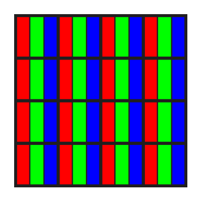
Traditional LCD screen
With traditional LCD screens, each pixel is composed of 3 smaller “sub-pixels” in either red, blue, or green. When viewed from a distance, your eye blends the 3 separate color values together, and you perceive it as a single color. With me so far? Let’s see how this compares to Pen Tile.
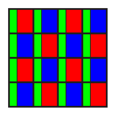
PenTile screen
With PenTile screens, each pixel is composed of sub-pixels, just like LCD. However there is one key difference. Each pixel does not contain a red, green, and blue element, instead it only has two! As seen above, each pixel has a green sub-pixel, but the red and blue sub-pixels alternate, with only one of them appearing in any given pixel.
What does all of this mean in terms of your viewing experience? Well, it’s simple: with less sub-pixels, you get less details, and your screen will not appear as sharp. Call it the “screen-door effect”, “pixelation”, or just “graininess”, but the result is the same. Less bits of color means a less defined image.
Back to the point about apples-to-apples comparisons, how can we truly compare screen resolutions when the underlying pixel geometry is vastly different? Well, the simplest way is to compare sub-pixel count instead of pixel count. You know what that means! It’s time for a chart!
![]()
As you can see, the Galaxy Note 7 is clearly the winner in raw pixel count with it’s 1440p screen compared with the iPhone 7 Plus’ 1080p. There is nearly a 2x difference between these two phones.
Things get more interesting when you compare the number of sub-pixels. The Galaxy Note 7 is clearly the winner in this category as well, but by a much slimmer margin. One might say that they’re close enough to be in the same ballpark.
Is counting sub-pixels the fairest way to compare screen resolutions? Well…probably not; as we learned earlier, PenTile alternates red and blue, but keeps green in every pixel. This was by design. Since the human eye is most sensitive to colors near the middle of the visible spectrum (i.e. green), you will achieve more perceived luminescence detail when trading half of the blue/red sub-pixels for green.
What this article should teach you though is that you should pay less attention to the raw numbers, and more attention to the finer points like pixel geometry. When in doubt, trust your eyes!


Good, this is what I was looking for in yahoo