Trying to imagine digital communication without emojis is like trying to imagine a smartphone without a cracked screen—it’s just unnatural. Back in the digital stone age, we were stuck banging our keyboards together using ASCII characters to express our profound emotions. Remember the classic ;–) or the whimsical (^_^)?
It was a simpler time, sure, but a painfully limited one. Since emojis aggressively entered the scene, they’ve transformed into a modern-day version of hieroglyphics. They are now an absolutely indispensable form of expression, allowing us to perfectly convey sarcasm, joy, and the undeniable urge to eat tacos, all without typing a single actual word.
From Scrappy to Sleek: The Evolution of Noto
If we take a trip down memory lane, the early days of emojis on Android devices were… well, an experience. Let’s face it: back then, Android was always a bit of a scrappy, slightly janky underdog compared to the hyper-polished realm of iOS. Believe it or not, the very first emojis on Android weren’t even in color! They looked like something you’d find etched into a 1990s pager. And who could forget the subsequent iterations with their delightfully quirky design choices? Yes, I’m talking about the infamous, squished jelly-bean “blobs.” We loved them, we hated them, but they were undeniably Android.
Over time, however, the Android operating system got significantly more polished, and along with it, its emoji collection—affectionately dubbed “Noto”—grew up. The Noto set slowly shed its awkward teenage years, becoming a much more refined and universally consistent standard.
Escaping Flatland: The 3D Revolution
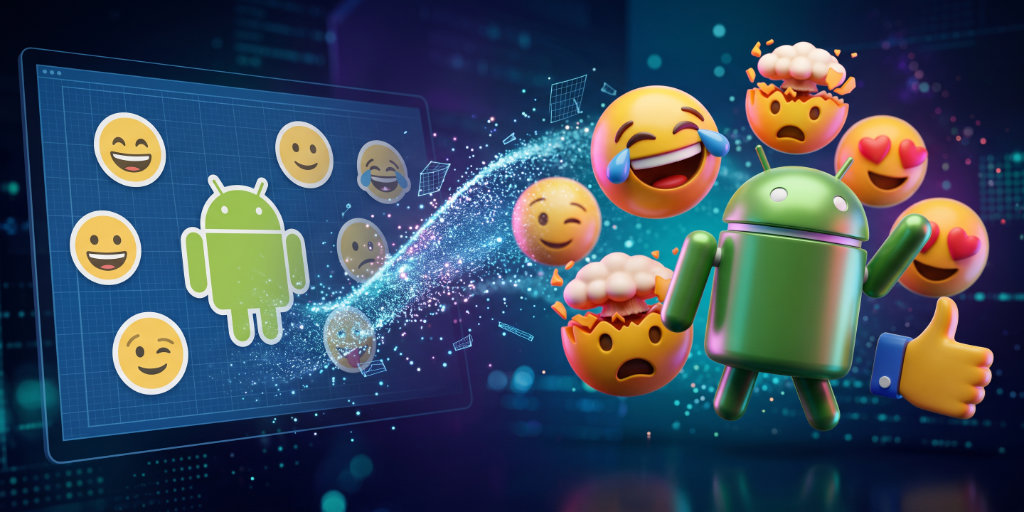
Despite the glow-up, there was always one glaring difference between Android and its fruity competitor: dimension. Historically, the Noto emoji library has always been designed using 2D vectors. From an engineering standpoint, this is brilliant—they are infinitely scalable and highly efficient. But visually? They always looked a bit flat compared to Apple’s richly detailed, raster-designed characters. Google tried to bridge the gap in Android 11, introducing more gradients and clever shading to mimic a 3D appearance, essentially playing a very convincing optical illusion.
But the newest iteration, which is beginning its global rollout with the shiny new Pixel 11, is the biggest redesign the platform has ever seen. The training wheels are off: emojis are now fully, gloriously 3D modeled. The result is a stunningly polished set of characters that look more tangible, bouncy, and closer to Apple’s coveted counterparts than ever before.
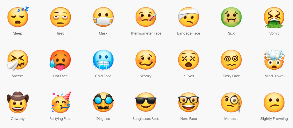
You’d be forgiven for confusing the Noto 3D emojis with Apple’s designs.
The Growing Pains of a 3D World
Of course, adding a whole new axis to tiny digital faces isn’t without its hurdles. The design team faced some serious redesign challenges, chief among them being readability. It’s remarkably difficult to ensure a fully rendered 3D object is still recognizable at a scale roughly the size of an ant. Additionally, they had to tackle the complex lighting challenge of making various skin-tones work flawlessly across both dark and light UI modes without looking washed out or overly shadowed.
Currently, these popping new emojis are available on the Pixel 11, but fear not—they will begin rolling out on other Google and non-Google devices starting later this year. In true Google fashion, the tech giant has also committed to open-sourcing the fresh designs and even set up a Github page for Noto 3D. They’ve explicitly committed to releasing the raw 3D OBJ files for all the creators and tinkerers out there. Just one minor detail: as of right now, those files are absolutely nowhere to be seen. But hey, good things come to those who wait—or to those who hit “refresh” on Github a few hundred times.